A style guide is a set of rules and standards to help enforce consistency and improve communication. They used to be exclusive to journals and publications, but they are now popular in web design.
My first experience with a style guide, although nothing like how I know them to be structured today, was in creating an HTML document to preview typography on the Web. While I was working at Hellocomputer in 2010, embedding custom Web Fonts via @font-face was still quite tricky for consistent cross-browser rendering. So I created a template so that the designer and I could see how a font family would render in the browser. Fortunately we had Paul Irish’s bulletproof @font-face syntax article along with Font Squirrel’s free service for converting web fonts. Things are a little easier nowadays with the wide selection of font families provided by services like Google Fonts and Typekit.
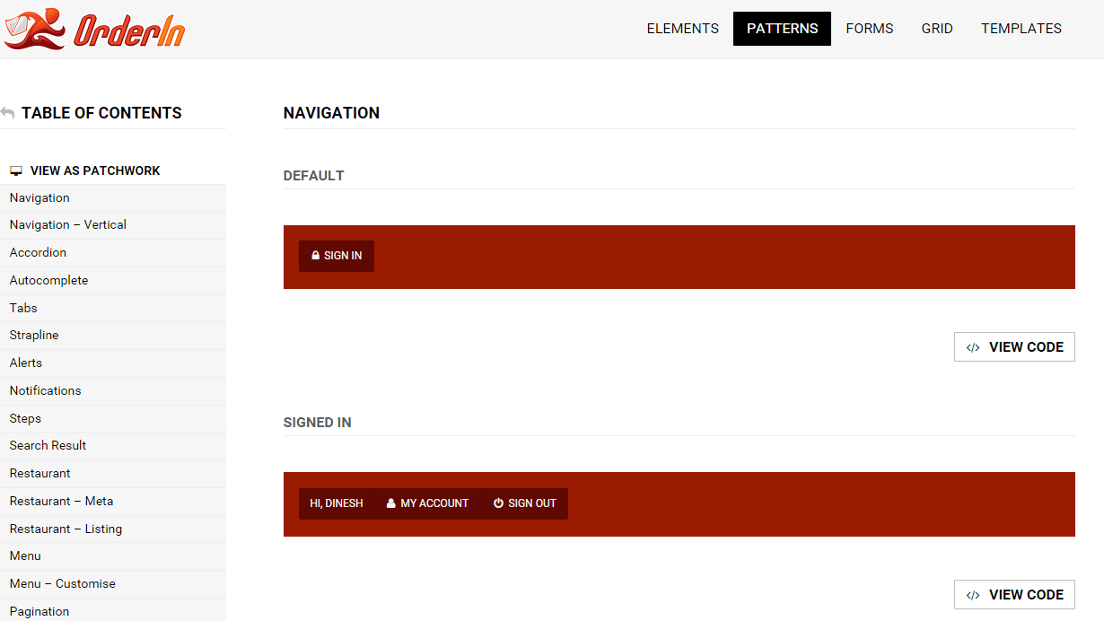
Fast forward nearly 4 years and the style guides I build and work with are complex systems, with typography forming only one section of the entire guide. Needless to say, typography is one of the more important aspects of web design, but there are numerous other components to consider. Based on Pattern Lab’s philosophy of “atomic design”, we need to cater for all the standard HTML elements, which are the building blocks for our design. These are combined to form patterns and later, templates which are finally displayed as the web pages our users see in their browsers.
Whilst some clients I’ve worked with haven’t fully grasped all the benefits of style guide driven development, there have been a few major advantages. The biggest benefit of this approach, is the ability to view the basic design styles in the browser as actual HTML elements far earlier in the project life cycle. Some of which includes typography and color palettes. This allows for earlier communication and discussion over design decisions, which can be easily altered at this early stage. No longer is the client left in the dark for months before the “big launch”.
Personally, I’ve found the ability to write better and more consistent HTML and CSS as a result of being able to troubleshoot cross-browser inconsistencies of elements and patterns in isolation. No longer are you trying to debug why a single element isn’t rendering correctly in a template due to some or other overriding style. It’s also forced me to work in a more modular way and look at reusing elements and patterns wherever possible. Because you’re building a system and not creating individual templates, you start to quickly see how pages are structured and what is shared and common amongst them.
The style guide I created for my website is quite basic, focusing primarily on typography. I found it helpful, even with a small number of templates, to have a consistent set of styles which I could define once and use throughout the website.
Final thoughts
Anna Debenham recently started a super project on GitHub, which is a collection of style guide resources. She, along with a bunch of contributors have added articles, examples and tools to help you understand and create your own style guides. It’s great to see how the community contributed and worked together to consolidate all these amazing resources under one URL.
If you have any resources of your own, please feel free to contribute to the project.